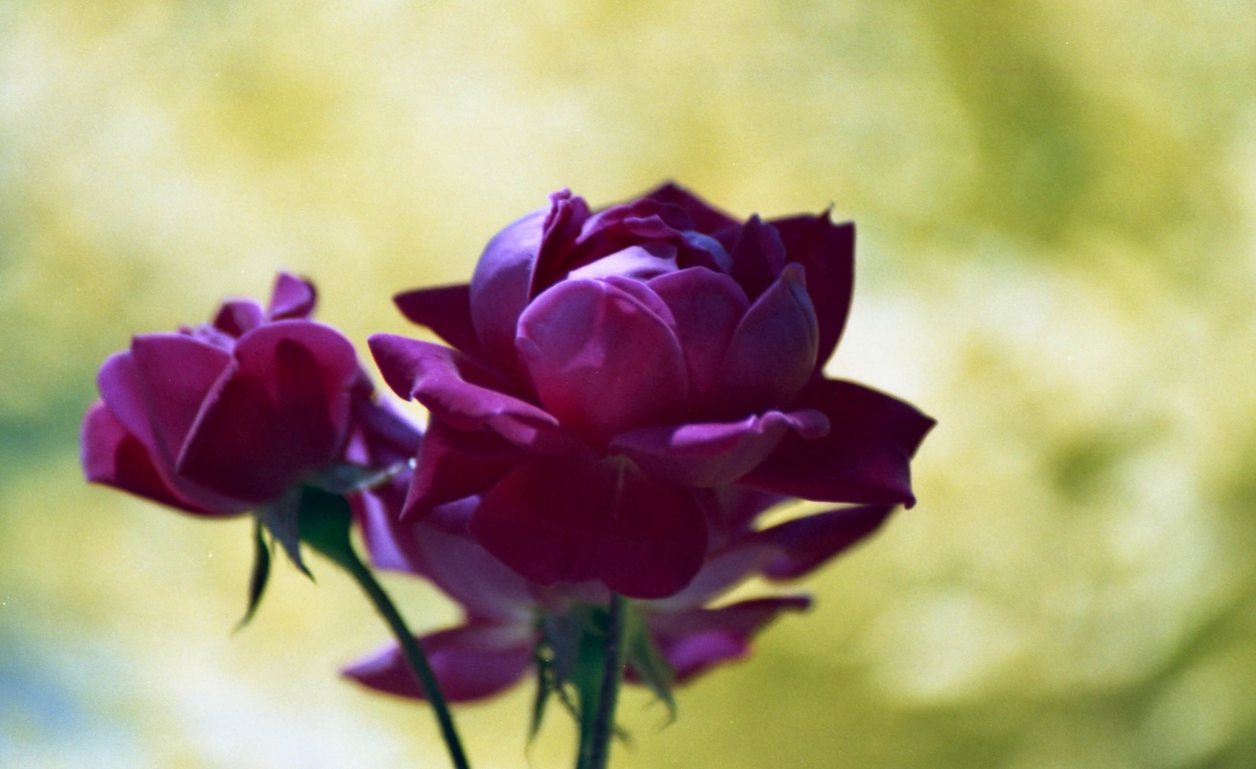
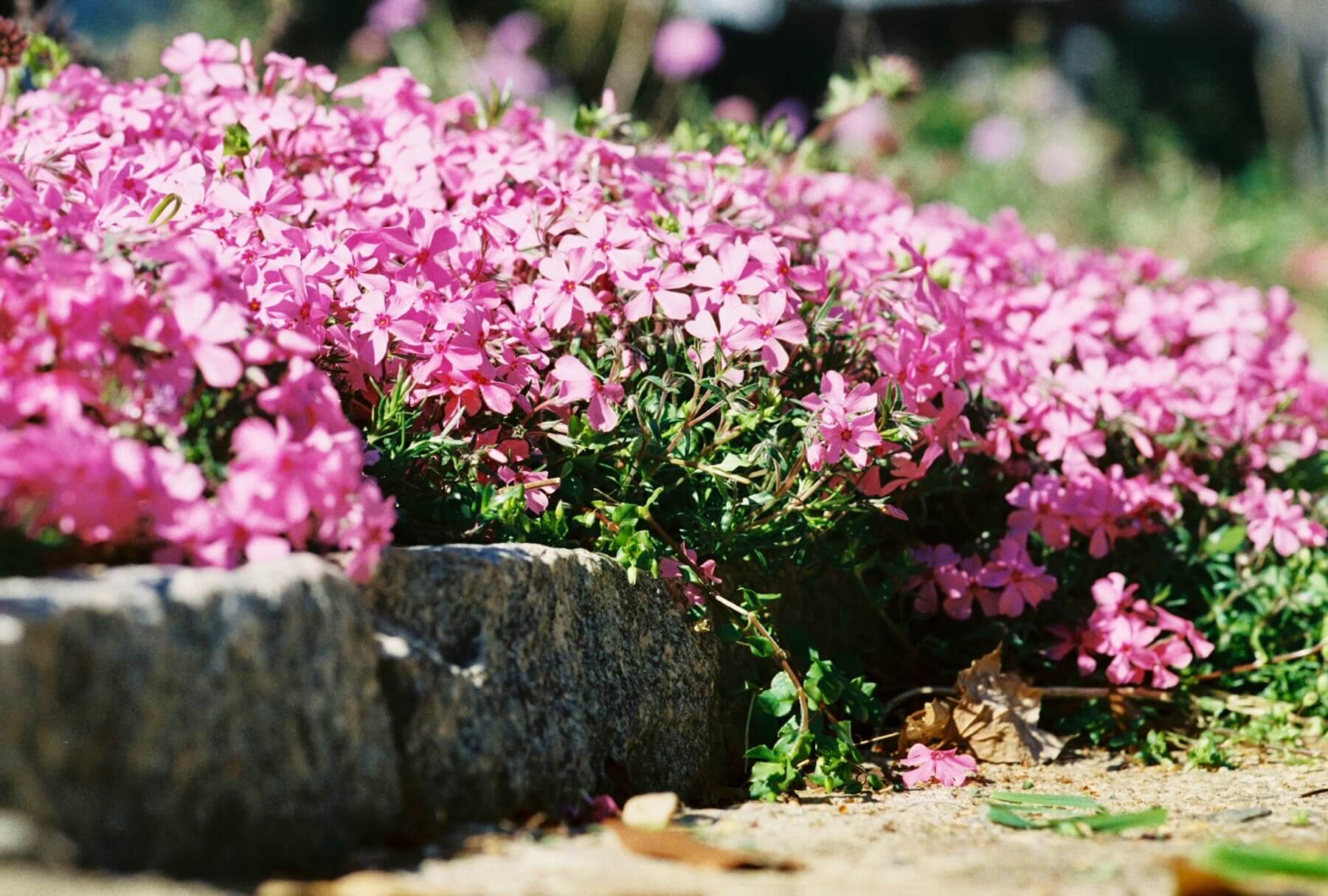
This is a story about reconciliation. Flowers have been the main focus from the beginning of my photography journey. I wanted to capture the garden’s color and vibrancy and make a few elegant floral portraits.
During the 2019 flower season, I tried six color emulsions: Portra 400, Portra 800, Ultramax, Lomo 400, Lomo 800, and Fuji Superia 400. Of that group, Portra 400 and Lomo 400 were my favorites. The grain in Fuji seemed too harsh compared to the other two. Portra had beautiful pastels, which went well with the pink flirt daylilies, and the Lomo 400 produced rich saturated colors. However, I wanted finer grain.
The pandemic arrived by the spring of 2020, and I started developing color at home. I chose expired Fuji 100 to experiment with my developing technique. But often, a frame would look smeared with very odd colors. After a few rolls, I was ready to try something else.
Ektar is extolled everywhere for its sharpness and color, so wanting sharp, rich flower images, I jumped on the Ektar bandwagon. I had two rolls of 120 Ektar 100 and decided that my first outing would be with the Yashica Mat 124. For reasons I cannot explain other than eagerness to try the new-to-me Yashica, I shot the entire roll on a cloudy, rainy day. The images came out flat except the reds, which were blown-out blobs. I was not happy with Ektar and felt I had wasted money for nothing. The other roll of Ektar 120 and two rolls of 35mm Ektar were banished to the freezer.


Fourteen months later, summer of 2021, I decided to use up the unwanted Ektar and shot an entire roll in an hour or so using a Maxxum 5. Many of those frames came out okay, but none were worth getting excited about. Then, a month later, while looking at YouTube camera reviews, I came across a video where the guy (Willem Verbeeck) was explaining how he scanned his negatives. He used the Epson 600, my scanner, but made adjustments I knew nothing about. After watching that video, I rescanned a few 120 Portra frames, and it was a revelation! Prior scans that I deemed unusable looked perfectly fine after a few basic adjustments. Then, thinking about my roll of Ektar, I rescanned these four frames.
The red bee balm is still too much, but it’s much better than before. Portra scans of red flowers turned out fine using the histogram and Epson Scan software. The default settings had been giving me poor color scans because they clipped both highlights and shadows. Ektar scans now look great. But the Ektar reds are still over the top and need to be toned down during shooting with at least -1.5 EC adjustment for red flowers.
All is forgiven. Ektar, please accept my apologies.


An interesting post – thanks. The colours are lovely. I recently bought my first few rolls of Ektar and look forward to trying it.
Would you mind sharing the link to the YouTube video you found? I have a terrible problem getting the right colours with Epson Scan.
Hi Del,
The link for the video is in this post (https://earthsunfilm.com/so-thats-how-histograms-work/) which explains how I used the info.
Willem Verbeeck created the video, and here is the link to it (https://www.youtube.com/watch?v=4G2L5dHBSy0). Hope it helps!