
Developing scanning expertise was never a goal for me. My practice has been to accept scanned images pretty much as they are. For black and white, this works nearly 100% of the time; color is another story.
Over the past year, I have been more focused on testing cameras than producing quality images. So, for the most part, I only cared if the photographs were sharp and properly exposed. Also, when I started blogging in February 2020, I already had 30-40 rolls of professionally developed and scanned images, so there was no need to be terribly concerned about the quality of my home-brewed images. Now that I’m moving from testing to trying to produce artistic images, developing and scanning results have become more important, and I have become more critical of the outcome.
While I always intended to develop black and white, the pandemic forced me to do color. Being wary of how finicky color development can be, I decided to start developing color at home using expired film. So far, I have developed about 23 rolls of color film, and only three were not past their use-by dates: two Kodak Gold and one Ultramax. Unfortunately, the roll of Ultramax and one roll of the Kodak Gold were shot using a camera with an inaccurate meter. So, if you are keeping count, there has been only one roll of “good” film. Even so, most scans were acceptable, and only a small percentage poor.
Until recently, I never bothered to investigate the poor quality images. That is because I knew nothing about scanner software nor histograms, levels, curves, and such, and I had not given much thought to learning how to manipulate them. My attitude changed a few weeks ago after using some expired 120 format Portra 400. Some of those scans looked fine, but others had bizarre color shifts and tints or looked wildly overexposed. I was less willing to accept poor frames because I had shot the film at 200 ISO and carefully metered each image with an app. Being confident the images had been properly exposed, I concluded that the scanner caused the poor images.
Foolish me started by trying to read the online manual for the scanner. After following numerous hyperlinks, I found explanations for scanner features but not when or how to use them. For that info, I turned to YouTube. As it happens, I found a video covering basic scanner settings, one of which was how to adjust the histogram for each image. That video is also how I learned one could select an image before scanning and not rely on the thumbnail display—live and learn. Happily, setting the histogram using the basic tweaks from the video alone corrected much of what was wrong with the image. Here are two histogram examples.

This is a crocosmia blossom. Red is always problematic because it is easy to lose details. It seems that the scanner reads red and clips much of the red data. In the first image, the low end is 107 and the high 180. Much of the detail in the flower petals is missing, the background is too light, and the greens have the wrong tint.

I adjusted both to include a wider range of data, moving the input low end to 101 and the high end to 193, and the mid-tones are set at 0.64. I made similar adjustments to the red histogram.
Here are the images straight from the scanner before and after the histogram adjustments.


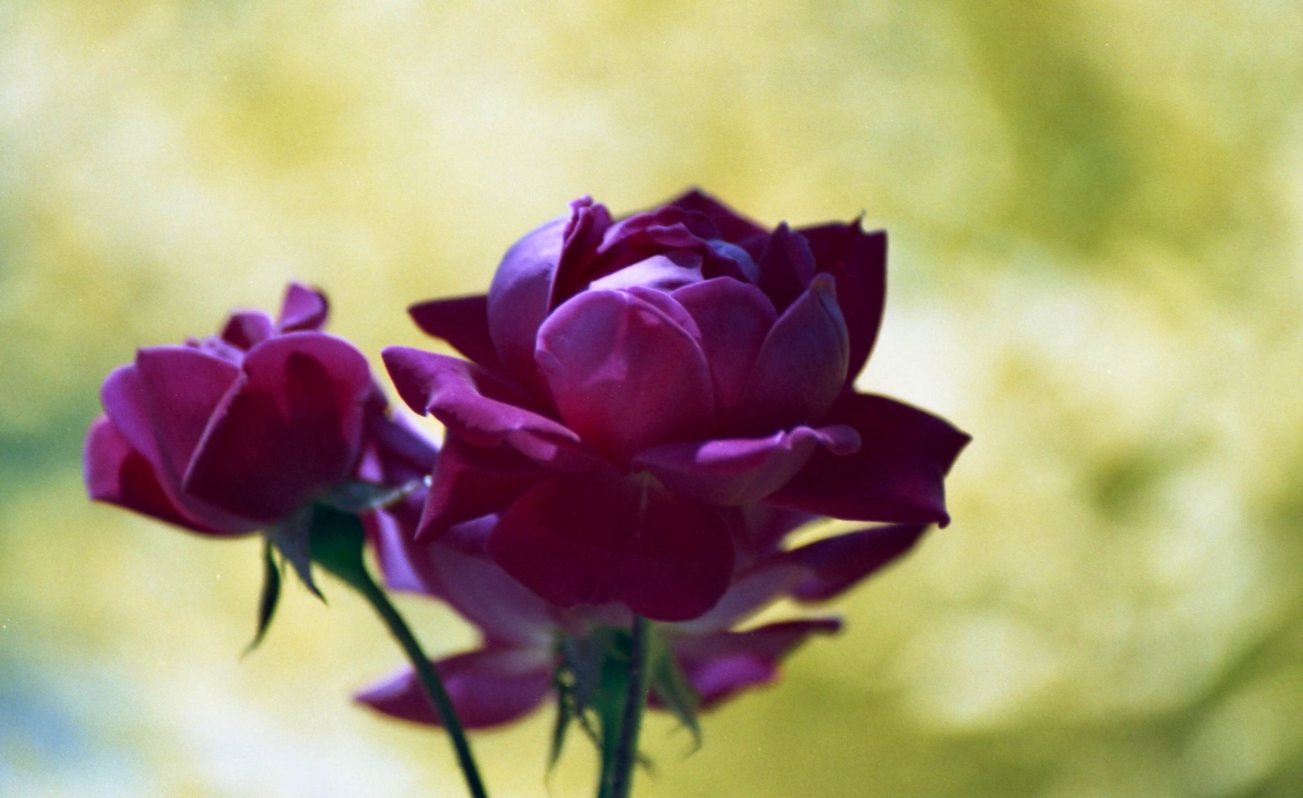
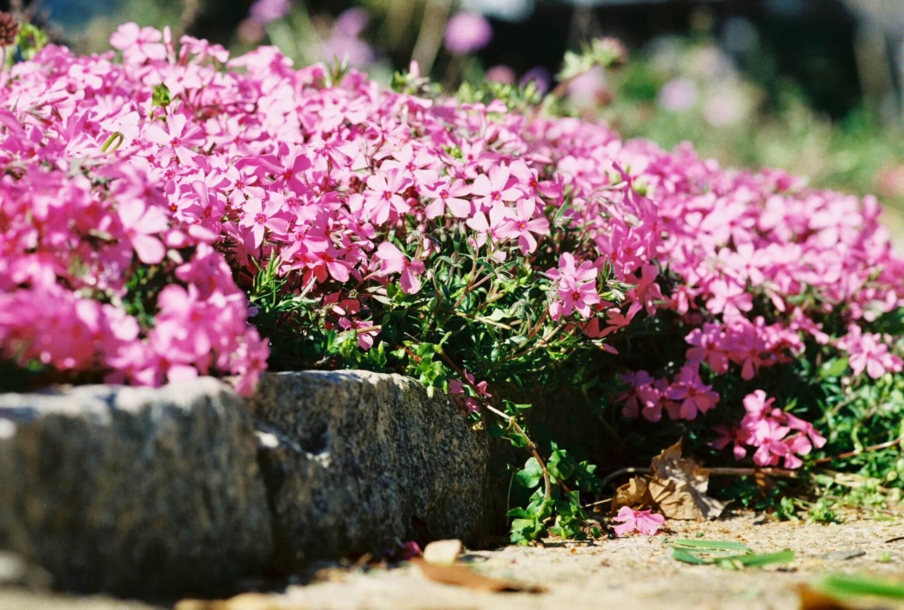
Here are two additional examples.


This has been an eye-opening experience! There have been so many scans that looked blown out like the one above, which I had always assumed were due to camera settings. I’ve also learned that scanning color images is as complex as making color prints—not happy to discover this. As with color prints, scanned color images HAVE to be adjusted—there is no getting around it. Now, at least I know how to fix a common problem. I’ll take that as a win while I learn to use the options in Apple Photos.


1 Comment