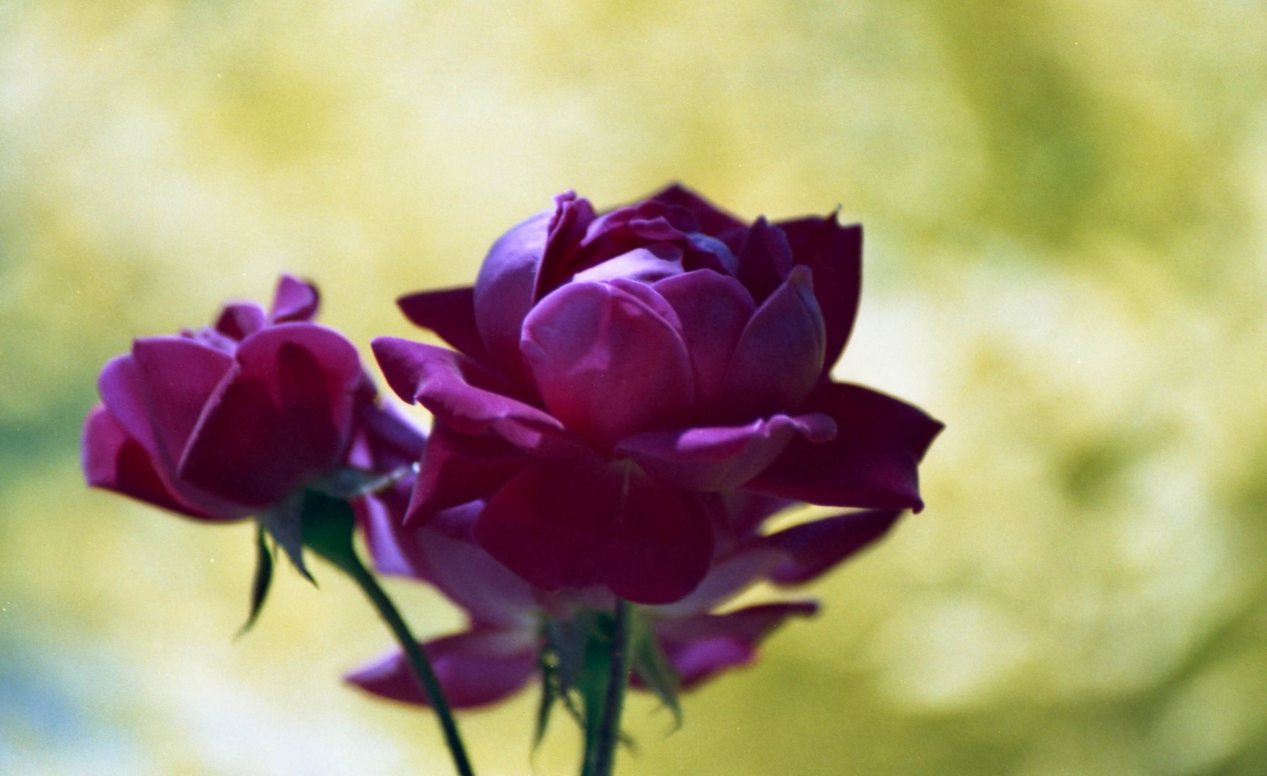
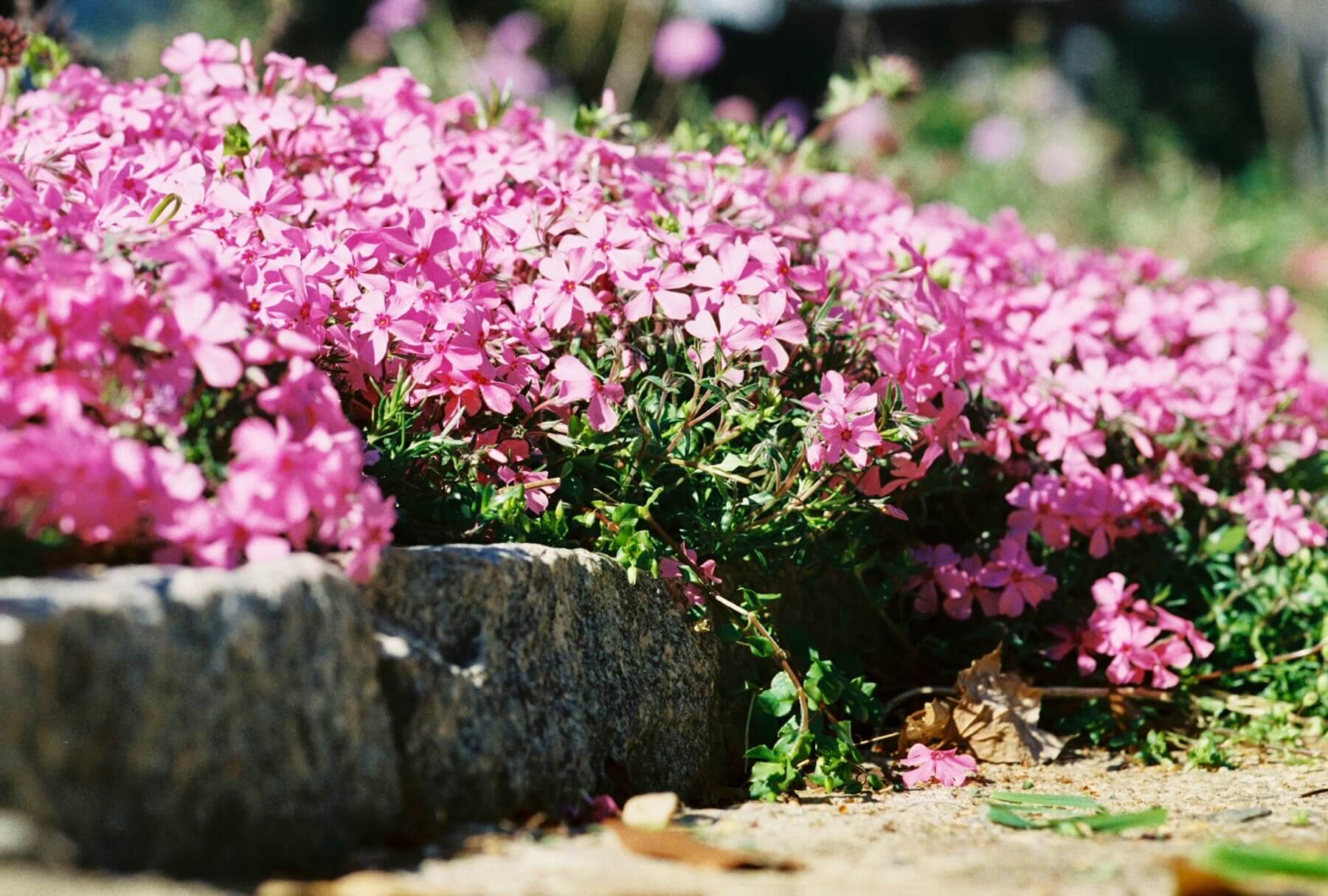
Last fall, I planned for a big 2022 garden season. New colors and groupings had captured my imagination; of course, I had a few potential floral images in mind. None of that panned out. Gardening season is past, and it is too early for me to consider next April. In the meantime, I will tackle the other big idea I have been toying with for two years: delving deeper into B&W photography.
One quickly learns that merely using B&W film doesn’t automatically confer artistic merit. As color film requires considering the color wheel and relationships, B&W requires one to take special notice of patterns and shadows. While being able to envision an image as a range of grays may come naturally to some, it does not to me. Over the last three years, I have shot a fair amount of B&W images–some I am happy with. Images with mid-tones have turned out very close to what I hoped. However, high-key and low-key images have been much more trial and error (mostly error).
I have focused predominantly on low-key shots, and adjusting the lighting and mood has required a lot of experimentation. For example, here is a series of photos taken to see how a white background and shadows would render when shot at metered level, then -1, -2, and -3 stops. In other attempts, I have tried adjusting the angle of light and/or the camera angle. Each change adds new variables and changes the resulting image.
Sometimes I like high-contrast, stark black-and-white results, while at others, I want more nuance. Backdrops also play an essential role in balancing a composition, and I have spent a decent amount of time studying paintings to get a feel for effective backgrounds. The starkness of the images below appeals to me. The middle image is my favorite.
One important lesson I’ve learned is that digital results do not transfer as readily to film as I had expected—at least not with low-key. The grain in film changes the image, adding character that isn’t present in digital. That various emulsions handle contrast differently is also becoming more apparent. Even though Tri-X curls too much for my liking, I like the amount of contrast it offers. In the same way, HP5+ seems better for scenes with more shades of gray. I have yet to try Delta and am still on the fence about TMax. Acros II, which I have heard great things about, is sitting on the table in front of me.
Next, there is the matter of film format/size. What looks grainy and uneven in 35mm can look great in 120. Fomapan in 120 looks fine, but 35mm, I’m not so sure about.
Since experimenting with film can be costly, I searched for help deciding how to proceed. Fortunately, I found a few good books. Two by John Garret, Mastering Black & White Photography and The Art of Black and White Photography, fit my sense of aesthetics, and I like his teaching style. In particular, Mastering Black & White Photography, which takes a case study approach, has proven to be one of my favorite photography instruction books.
The Black and White Handbook: The Ultimate Guide to Monochrome Techniques, by Roger Hicks and Frances Schultz, is another good book with plenty of technical info specifically for B&W film. Having gone through it, I have found some helpful hints on composition and lighting.
What’s next? The most logical step seems to be painting a few backgrounds that could complement scenes with a lot of mid-tones. I have collected a few examples to work from that should be suitable for black and white. For low-key shots, I have cloth backdrops that should work well. Scavenging the basement for props should help too.
In all, I have a lot to keep me busy, and it should be February before the garden’s colors and textures insist on my attention. Until then, there is plenty of paint and a bunch of film—we’ll see what happens.


